










 POLYWOOD
My Wishlist
Easily build your wishlists, or save them for later to add to the cart. Click here for details.
POLYWOODEasily build your wishlists, or save them for later to add to the cart. Click here for details.
Main Menu - Mobile

The best patio color schemes are about more than just paint — they come together through careful consideration of personal preferences, desired mood, natural lighting, surrounding landscapes, existing architecture, and other factors.
This may seem like a lot of mental work, but it’s actually quite simple — especially when you’re guided through every step of the process.
We’ll show you how to build a backyard color palette. Explore our patio color ideas, planning tips, popular shade combinations, furniture and decor advice, and other style suggestions that will help you set the perfect tone for all your outdoor endeavors.
Whether it's time for a total makeover or you just want to introduce a new hue (or two), there are multiple aspects to consider. Just remember, there’s no single best patio color — only the one that best suits your home and lifestyle.
Your outdoor spaces should fit seamlessly with the rest of your home and showcase your personality. This creates an inviting and cohesive environment that enhances the overall aesthetic and comfort, giving a true reflection of who you are and how you live.
If you belong to an HOA, find out if any rules and restrictions exist, as they may dictate the home exterior updates you can make.
Consider your home’s style, exterior paint colors, and patio composition to narrow your choices. Look for shades that accentuate these elements, like creamy off-white to complement your house’s charcoal siding, or sage to contrast with a red brick patio.
Note any visible changes throughout the day, and if your current palette looks different under direct sun, shade, and light fixtures.
While dark tones help create a cozy vibe, lighter hues can make a patio appear larger. Avoid overuse of deep shades like black or forest green in small spaces, as they can make a space feel cramped. Instead, opt for whites, pale wood tones.
Nature is always a great place to find inspiration. For example, if you live in the Pacific Northwest, you may seek a mix of blues, greens, and greys that mimic the misty ocean.
Think about how you want your patio to serve your family and choose hues that enhance the aesthetic. Try soothing green tones for lounge zones and study spaces, or a warmer palette with reds or yellows for your dining area.
This is a good place to begin building your color palette. We suggest a balanced approach that makes your space stylish yet easy to update.
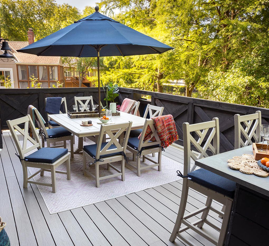
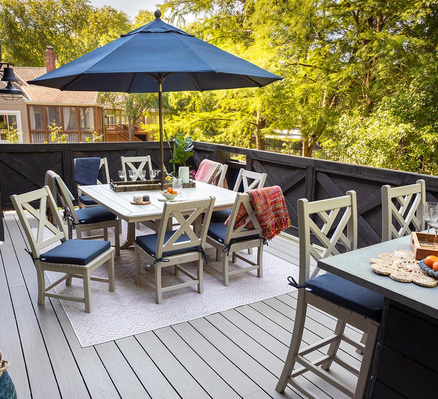
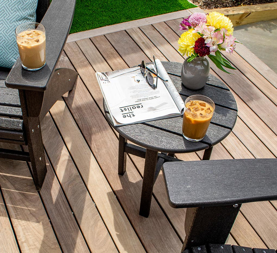
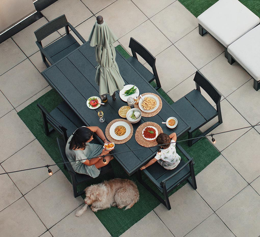
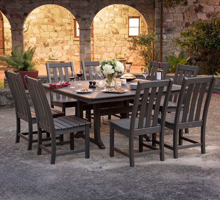
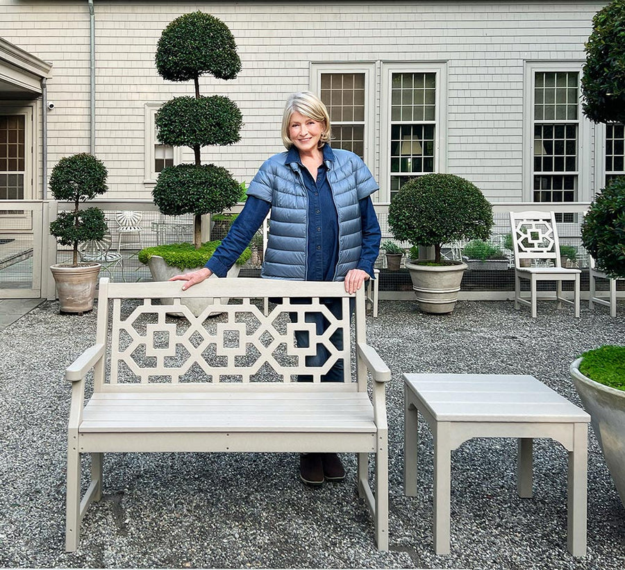
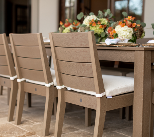
Neutral patio furniture colors, such as grey or teak, for large focal points like sofas, sectionals, and dining sets. It allows you to create a versatile foundation that blends with the pre-existing colors in your space.
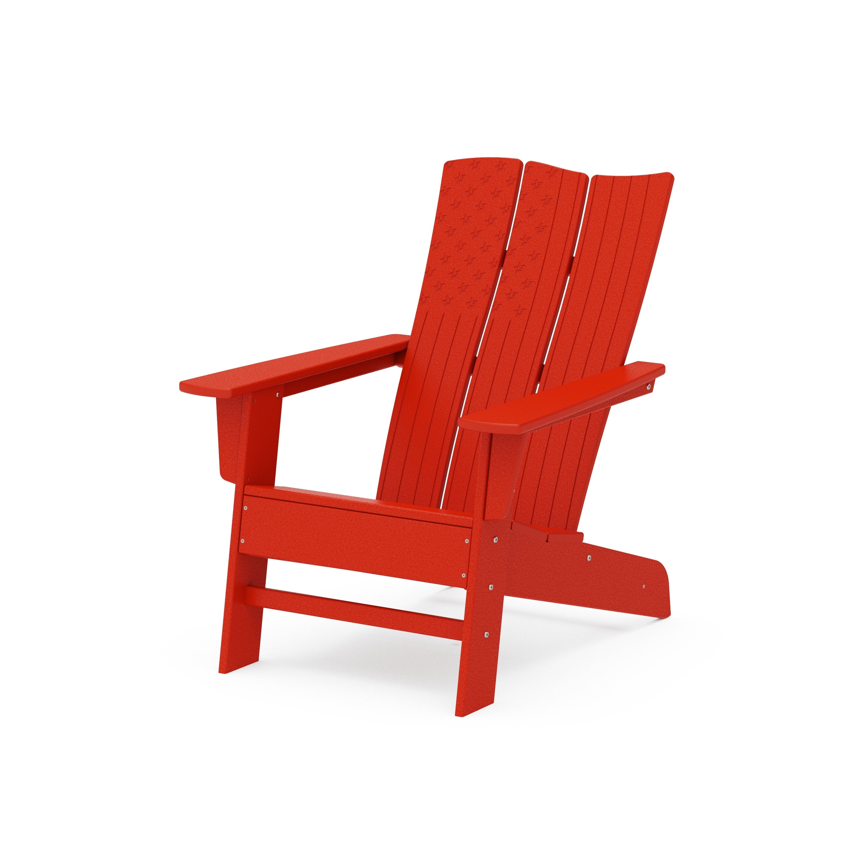
Save the bold and bright colors for outdoor furniture and decor that’s smaller, like accent tables or cushions. You’ll still be able to add visual interest and personality without overwhelming the area. Plus, swapping these out as tastes and seasons change is easier on your wallet.
Let’s explore the most-loved colors for patio furniture.
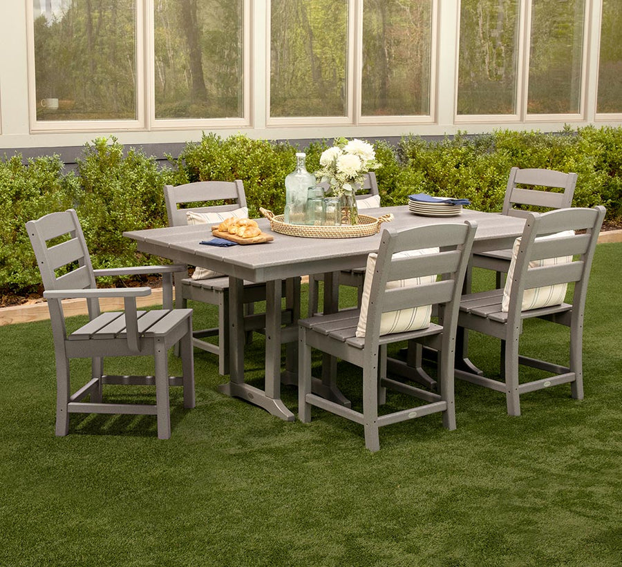
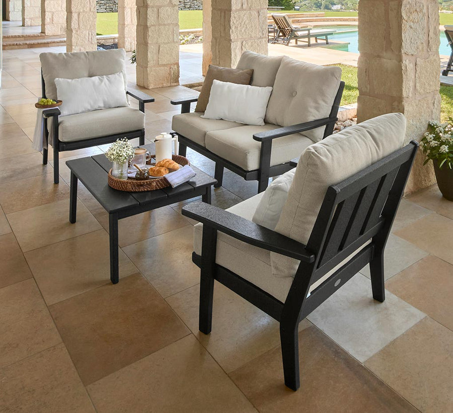
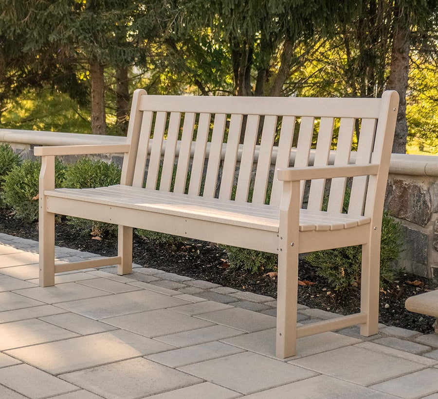
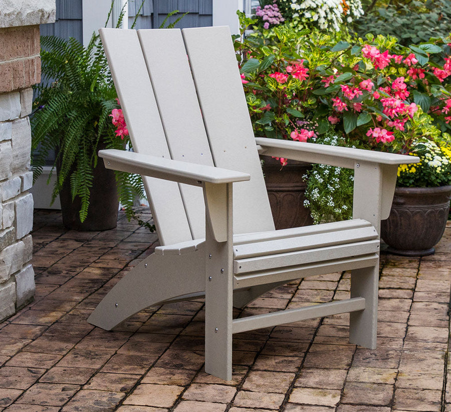
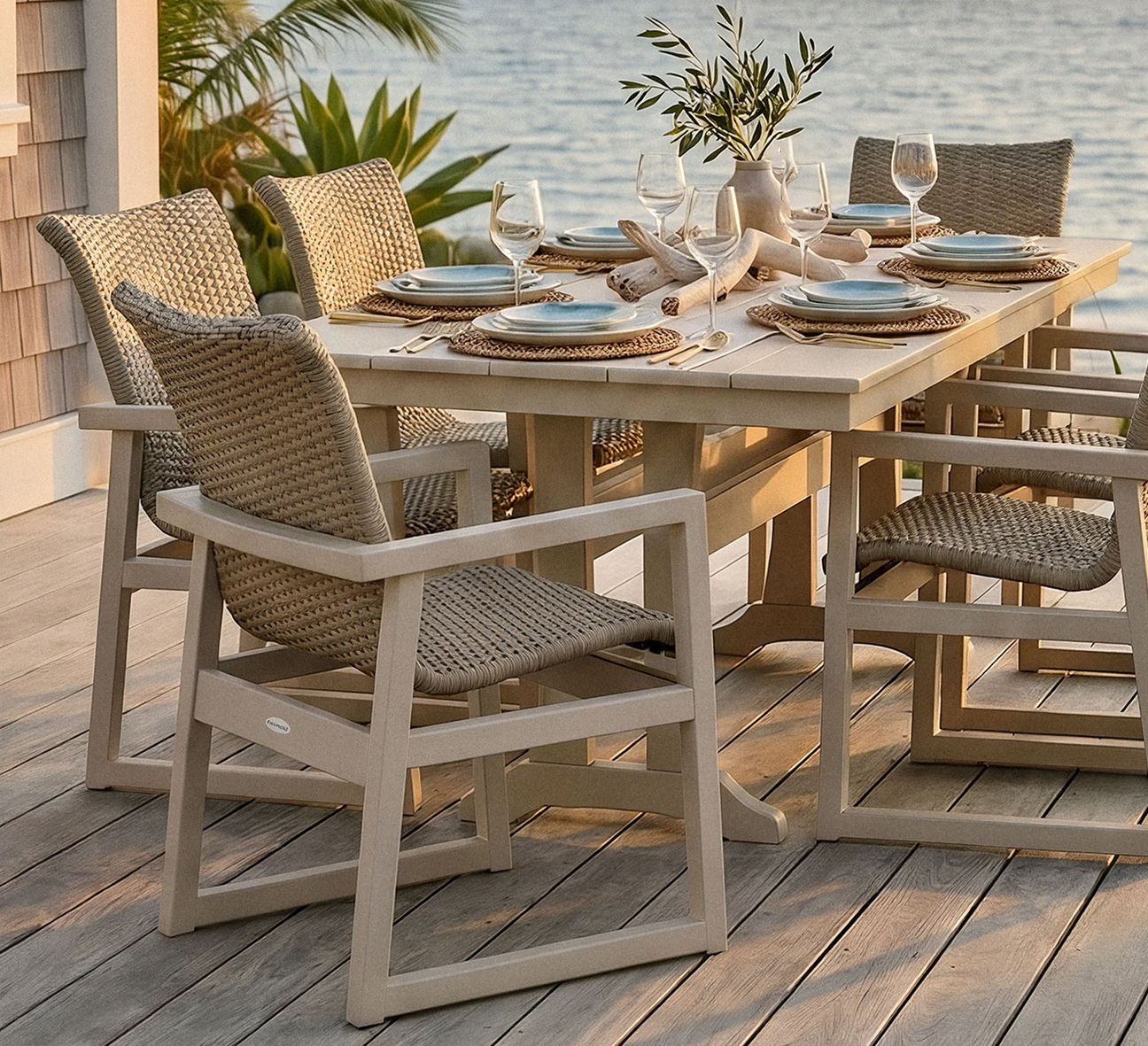
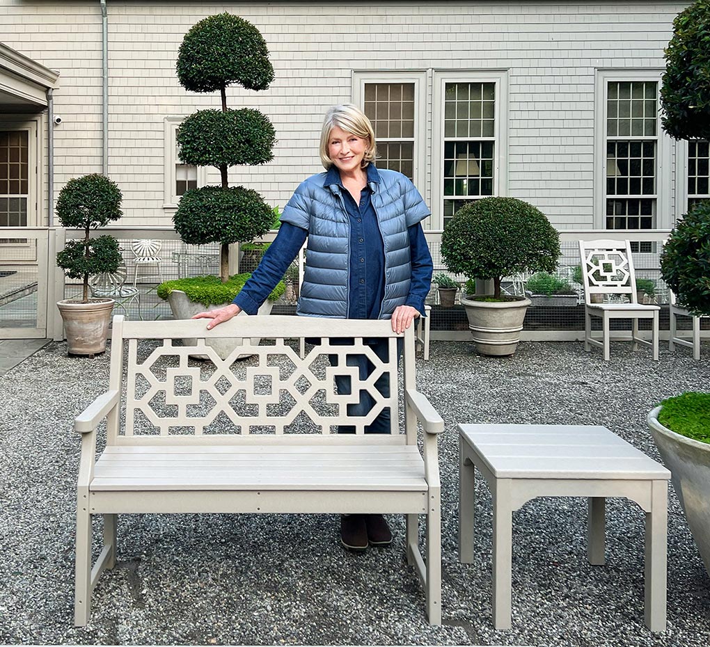
The versatility of beige, taupe, or grey patio furniture shades is unmatched. These colors have a timeless appeal, and calm, inviting energy that fits a range of outdoor settings.
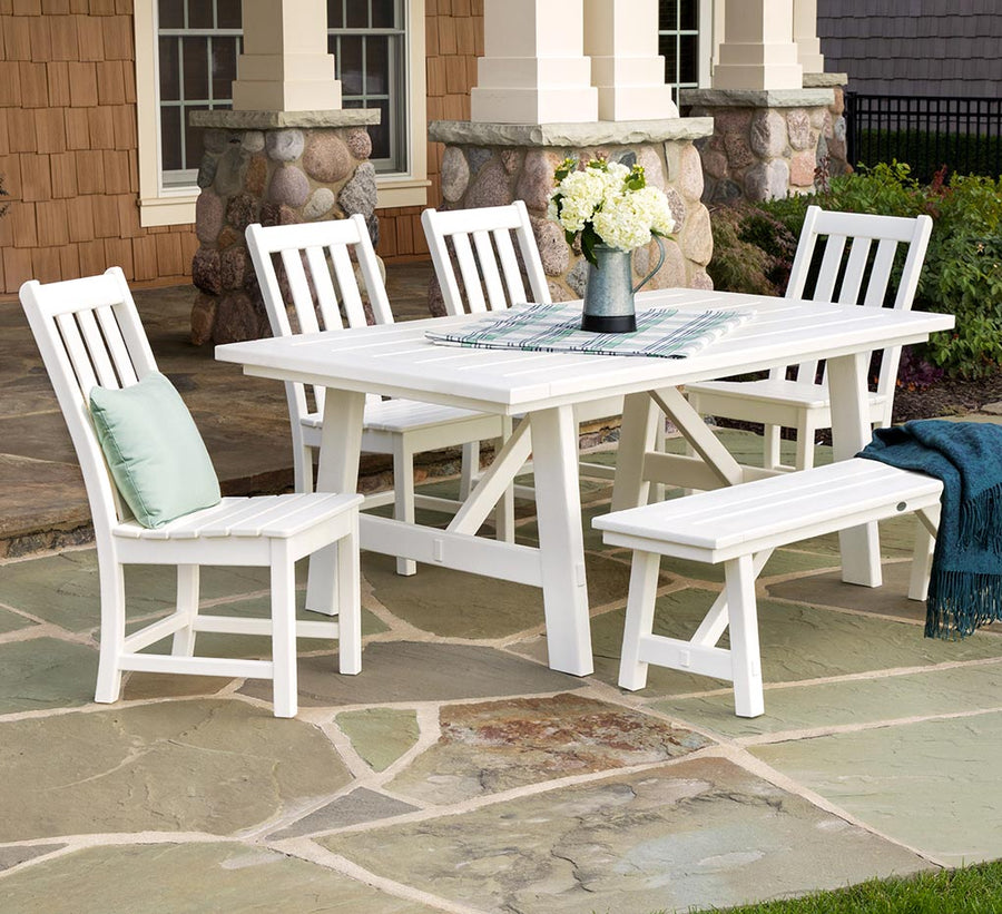
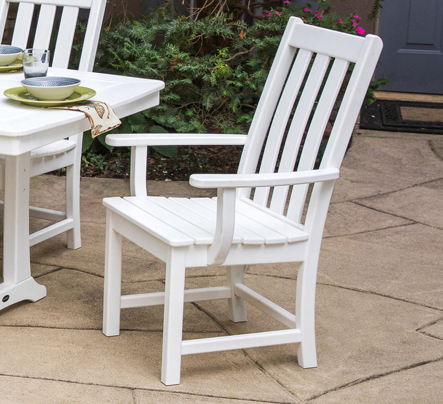
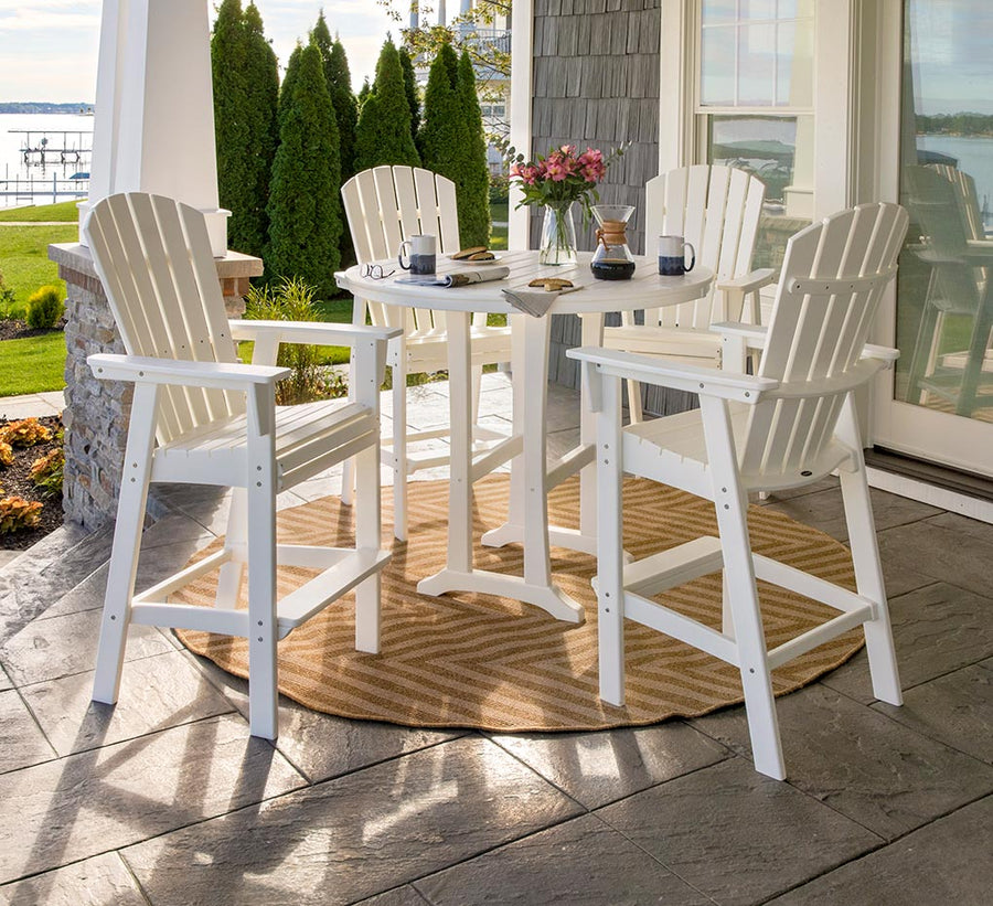
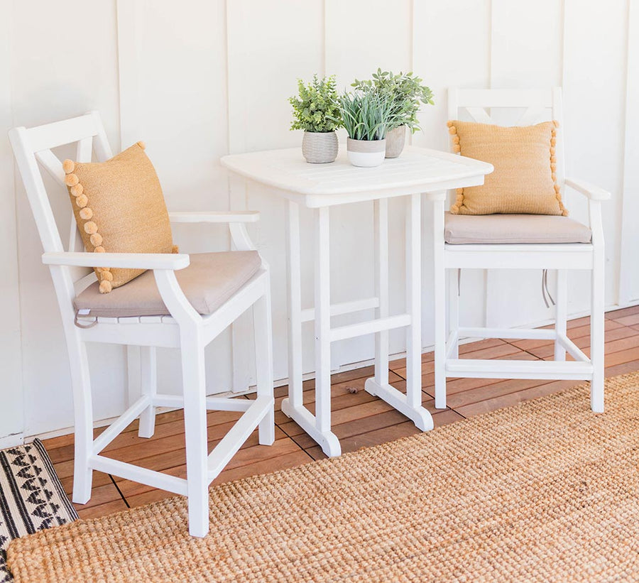
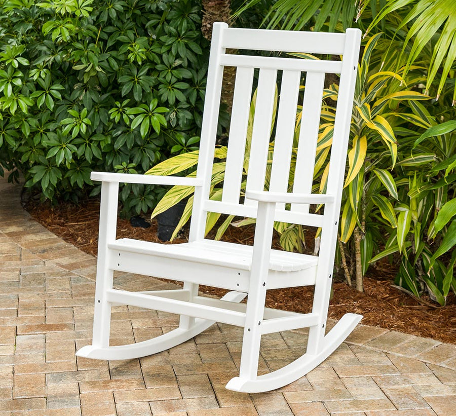
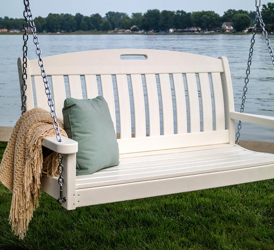
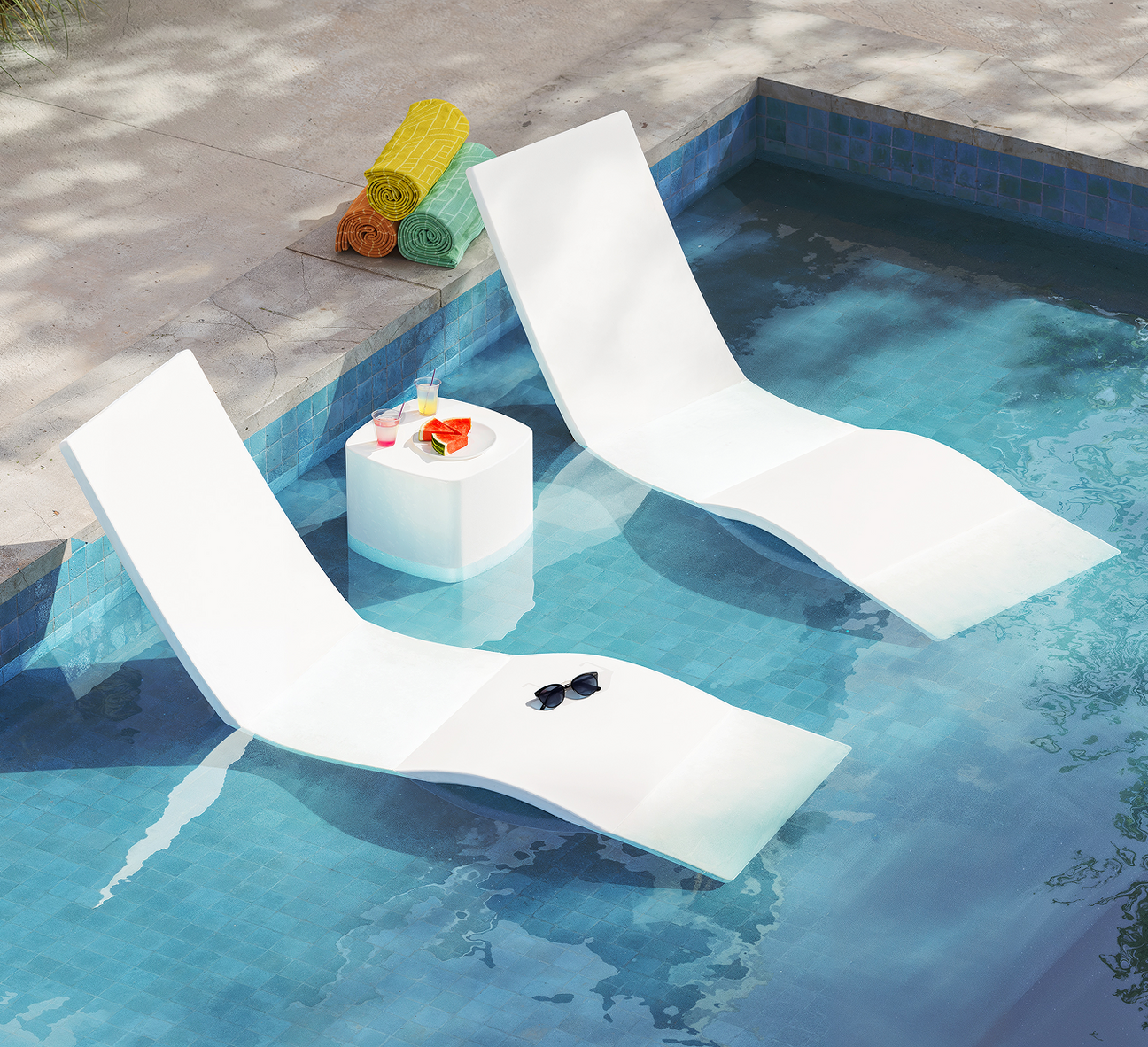
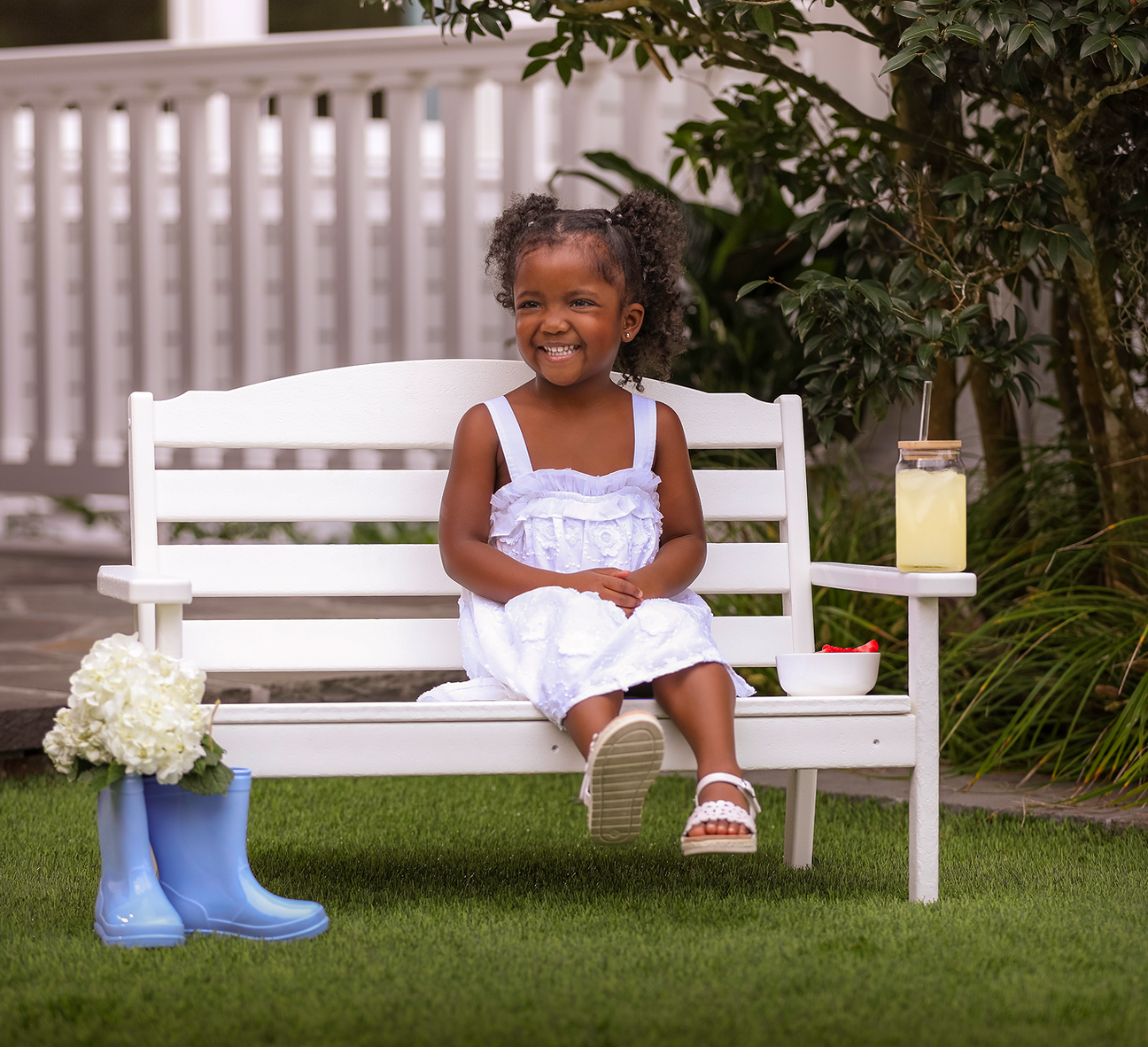
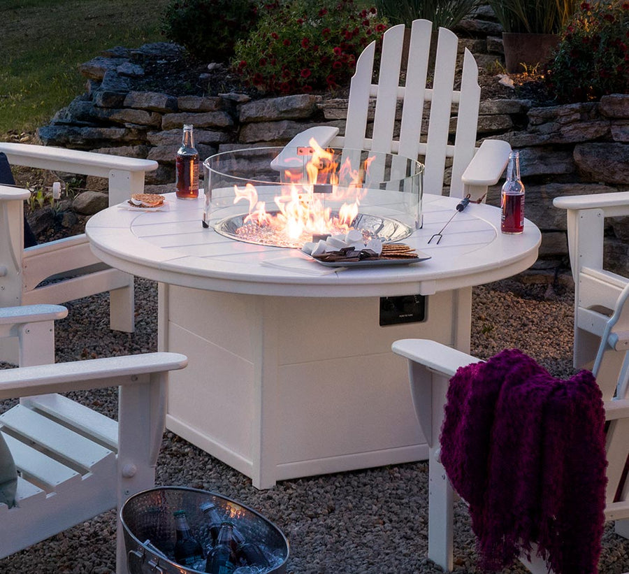
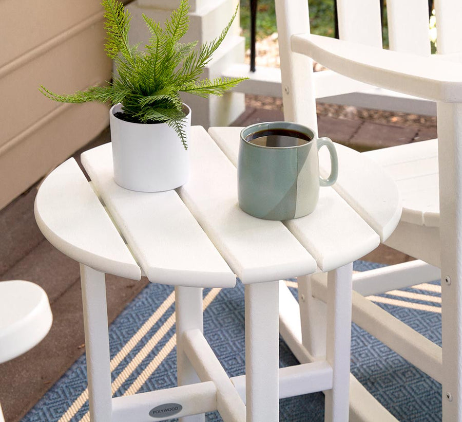
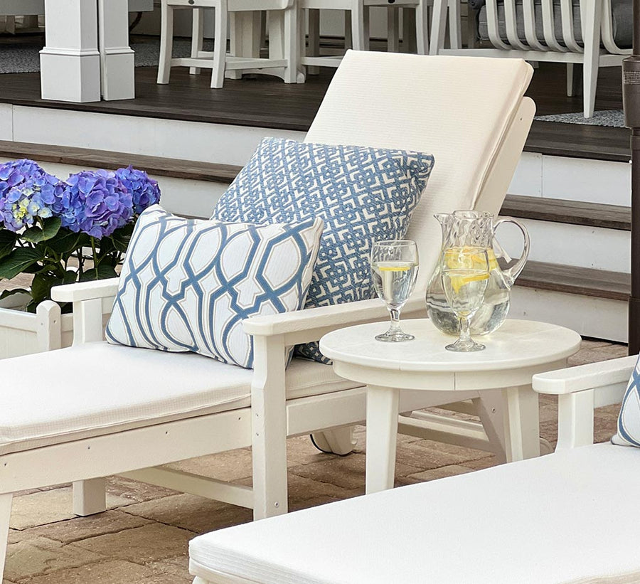
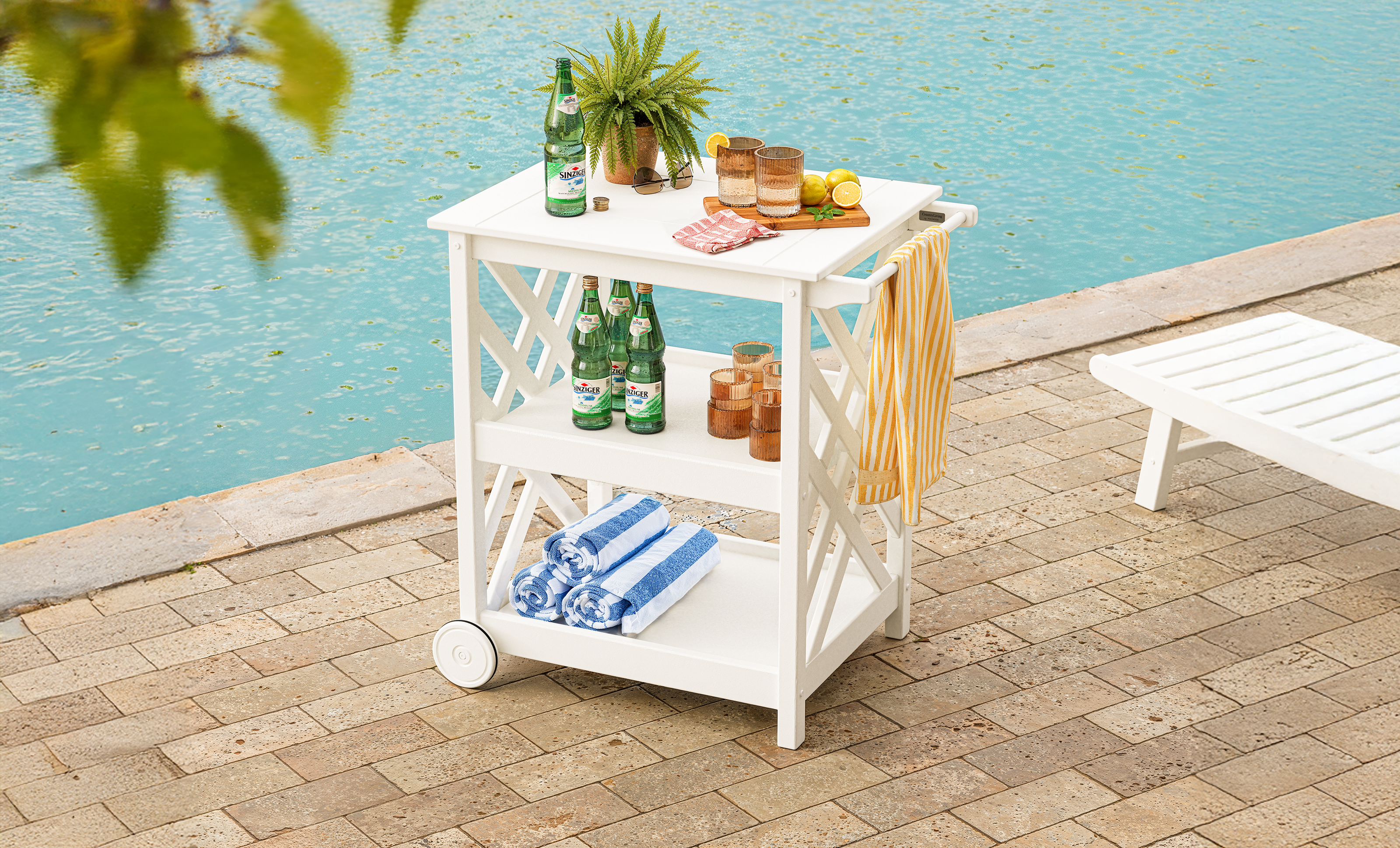
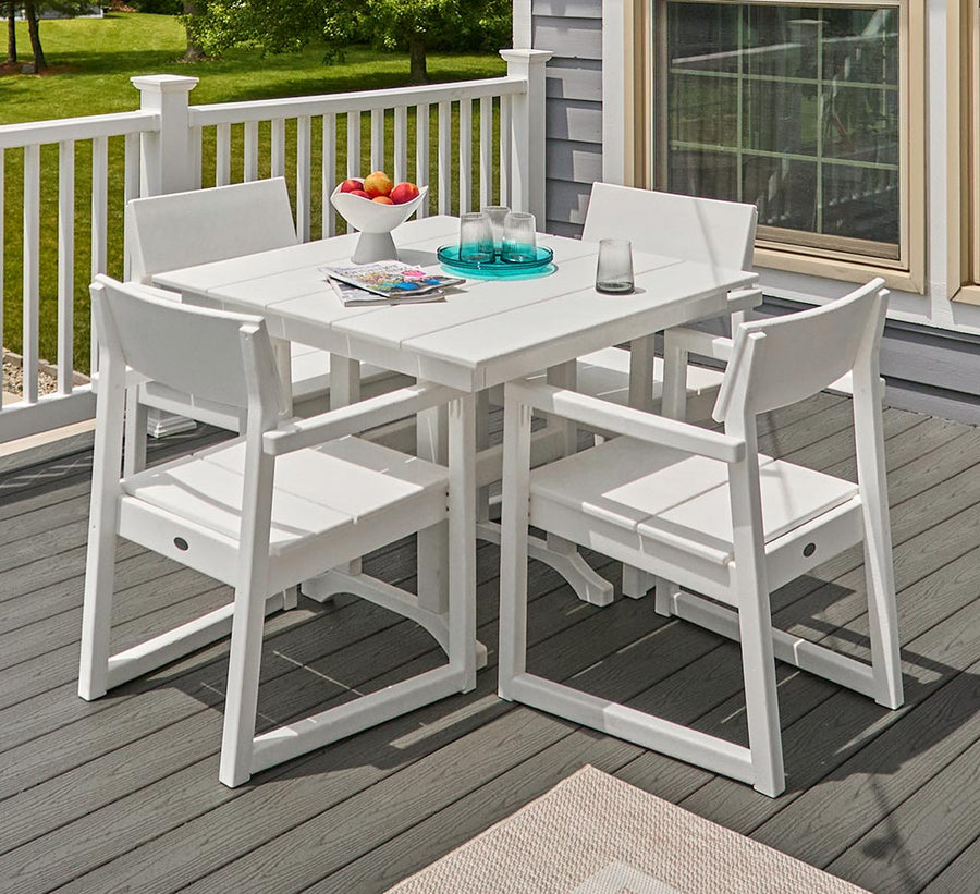
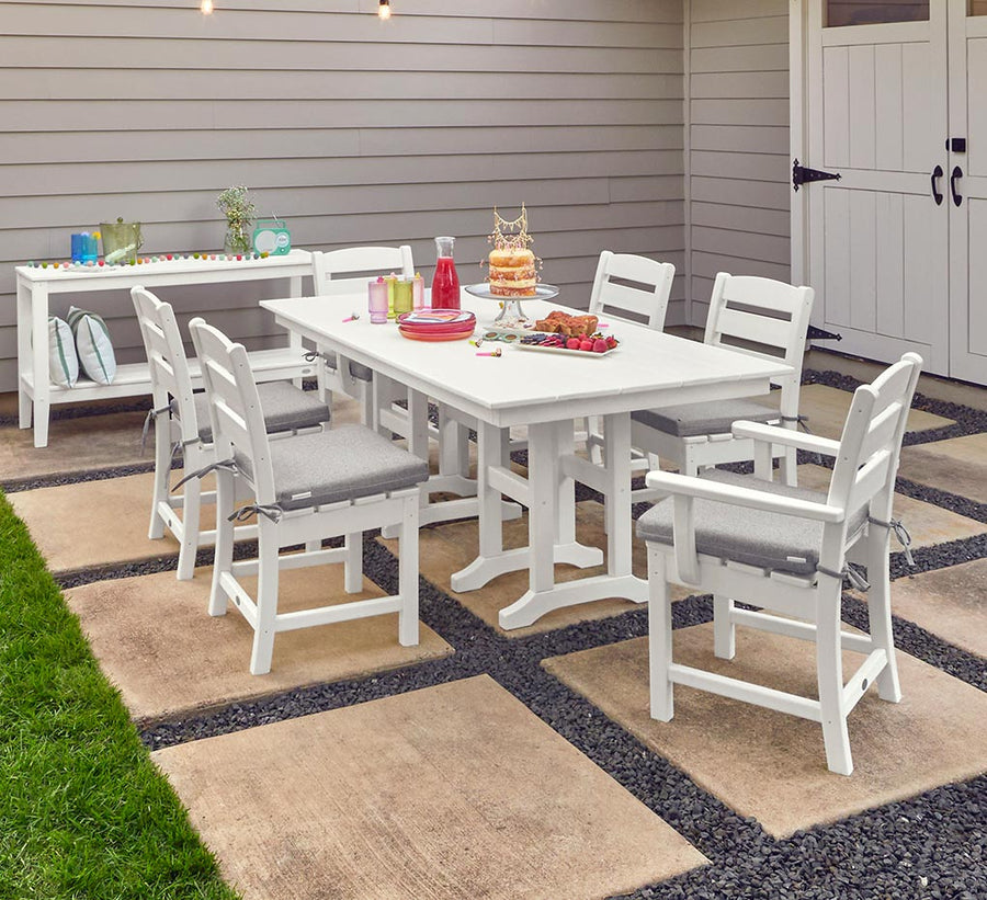
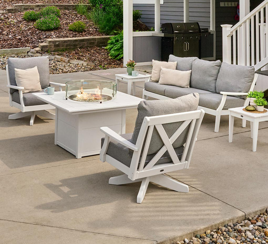
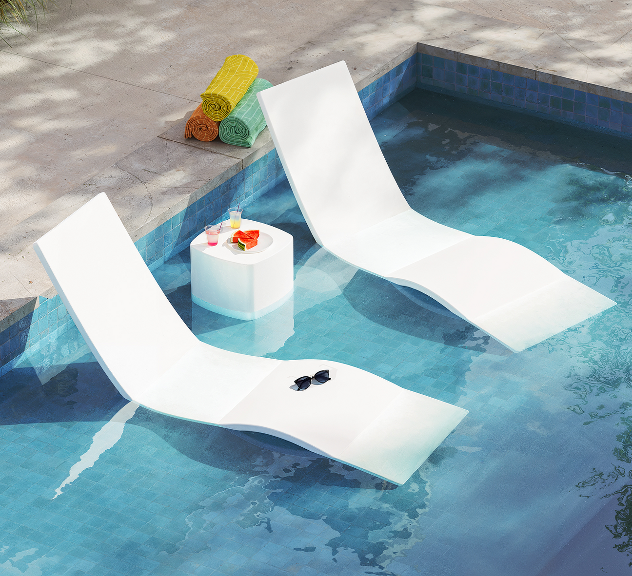
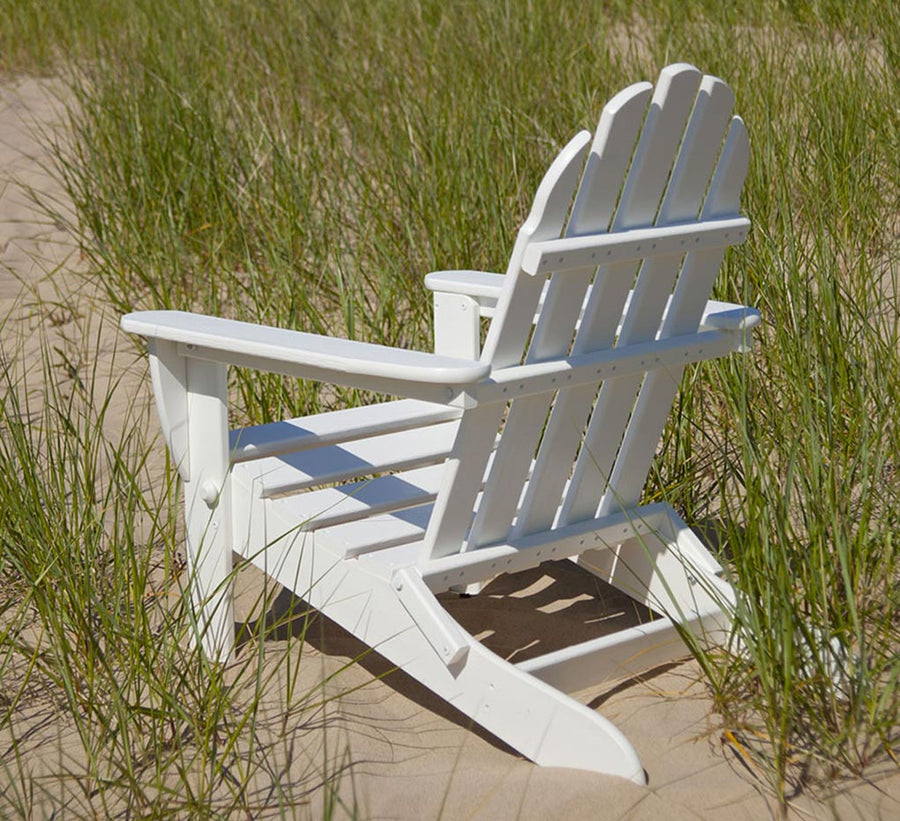
Clean and classic, white outdoor furniture can brighten any space. White reflects light better than any other color, which is why it’s preferred in small space designs to make them appear larger.
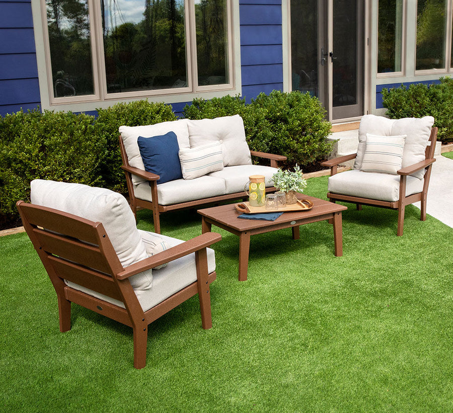
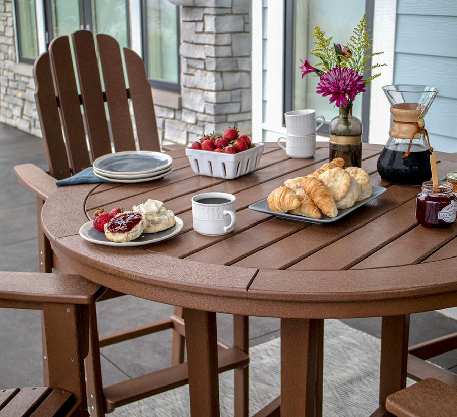
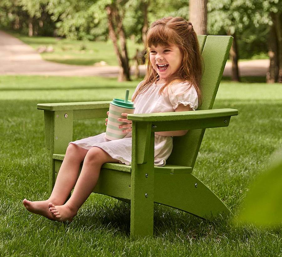
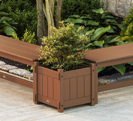
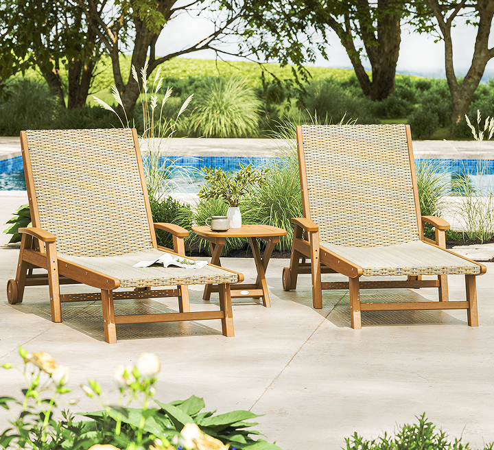
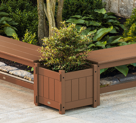
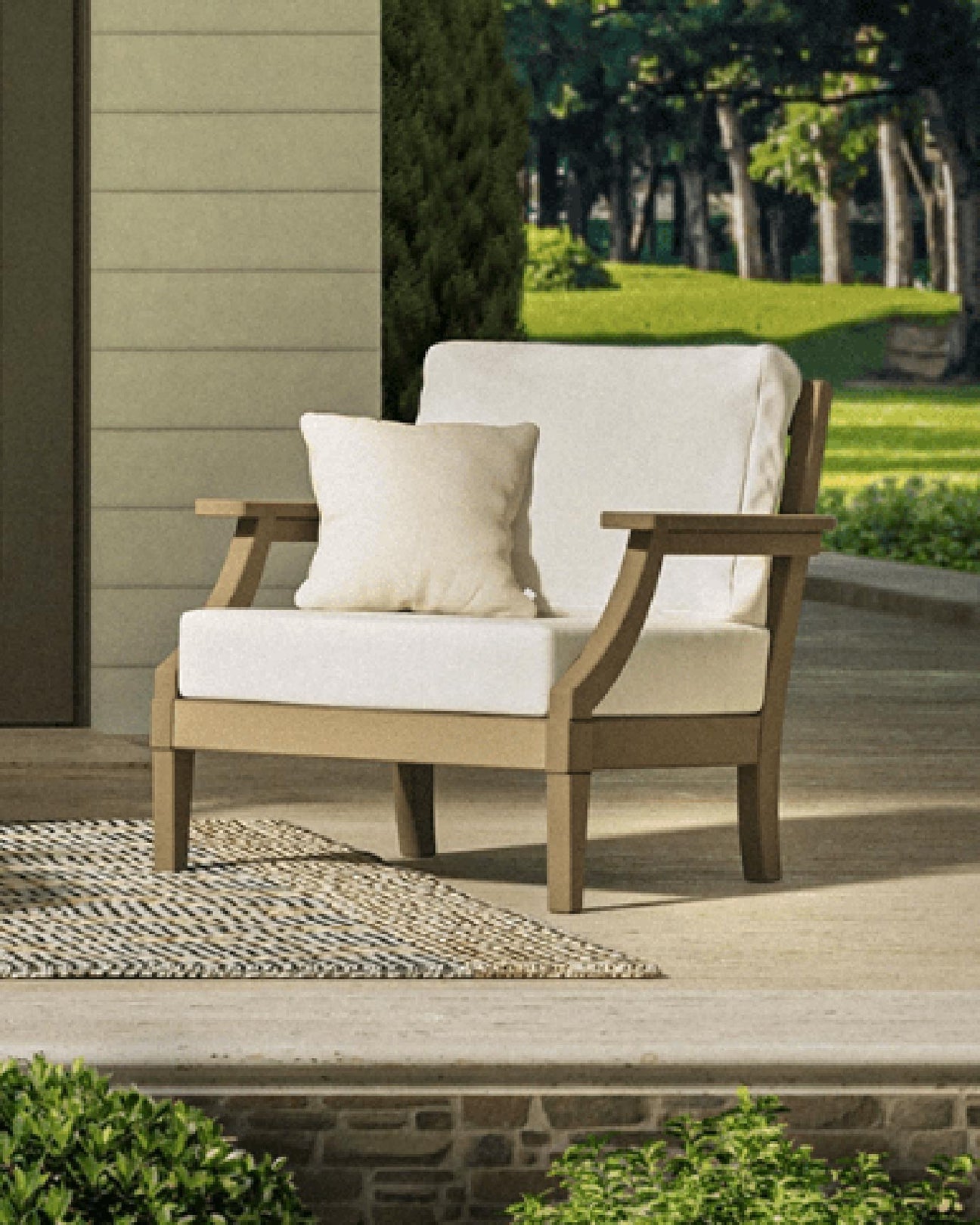
Woodsy brown, warm clay, or rich green patio furniture complements your home’s natural surroundings and anchors a space, making the look feel balanced and complete.
Sunny yellows or bright teal patio furniture instantly grabs your attention and livens up a space. These shades are fun and energetic. They can also dominate a space if overused, so be mindful with your decorating choices.
Bronze, silver, and chrome add visual interest and a touch of sophistication to a space. Their light-reflective properties add depth and contrast to focal points or accents.
Colors dictate your patio’s mood. Consider these shade combinations and pick the one that will bring your desired vibes.
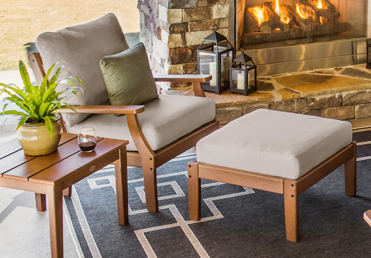
Teak serves as the dominant shade in this inviting color palette. The furniture showcases a mid-town brown that’s beautifully complemented by the mauve pillows, while navy-and-white checkered cushions provide a striking contrast.
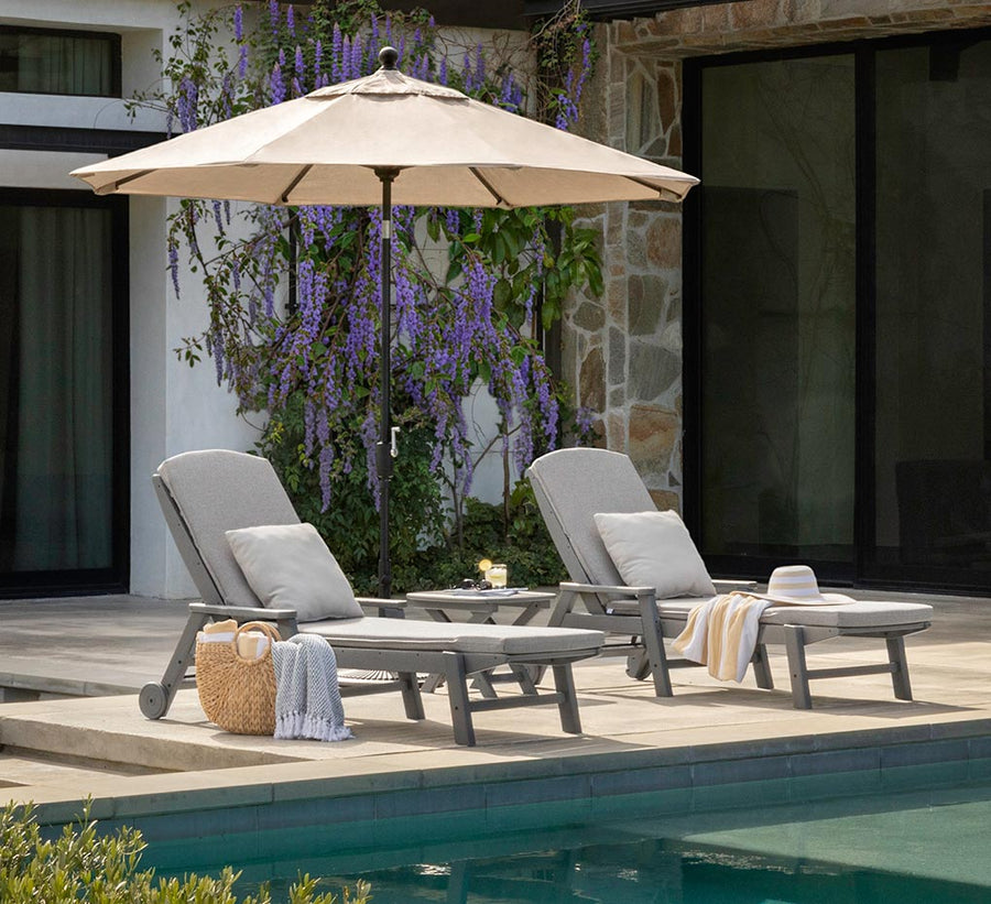
Dreamy pastels add a bit of whimsy to white patio furniture. These white chaise lounges are warmed up with coral cushions and mint green umbrellas, creating a color combination that beckons the eye and calms the mind.
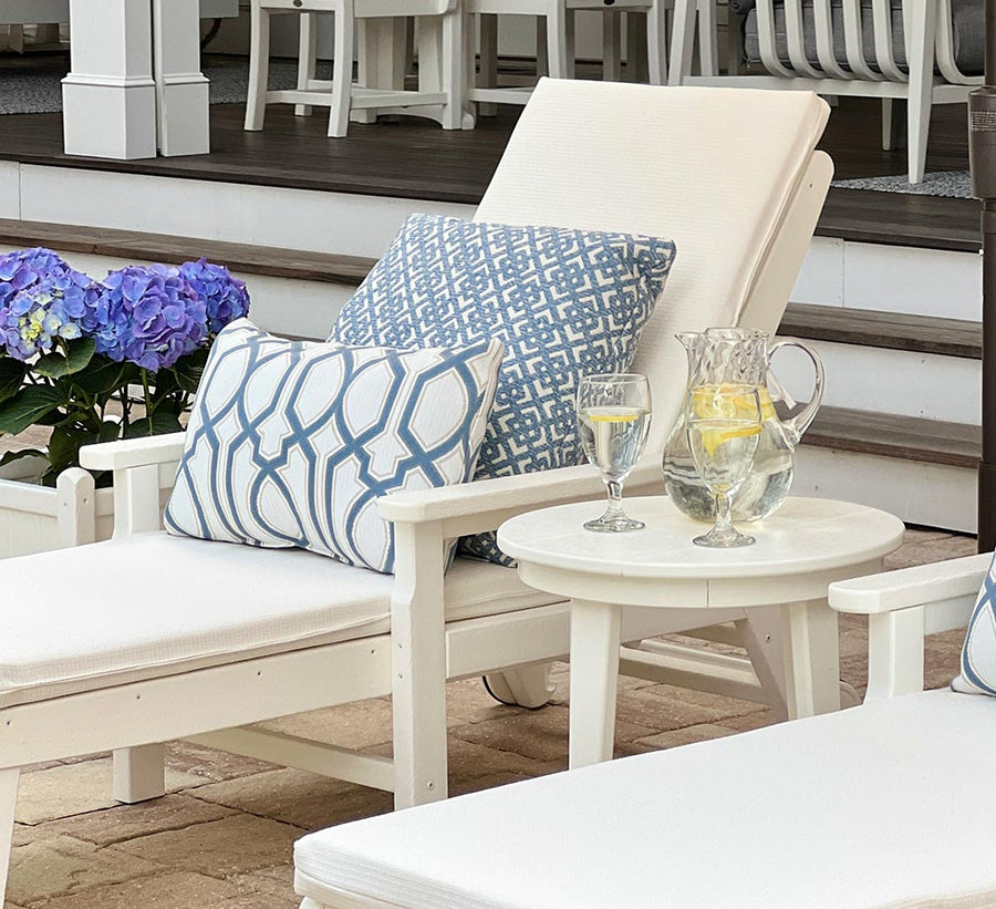
Notice how the pillow’s warm beige fabric balances the cool undertones of the navy bench? This creates a serene aesthetic that’s popular in coastal homes and transitional-style designs.
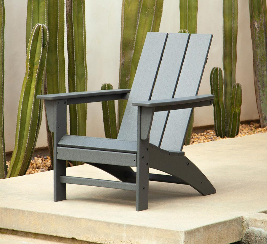
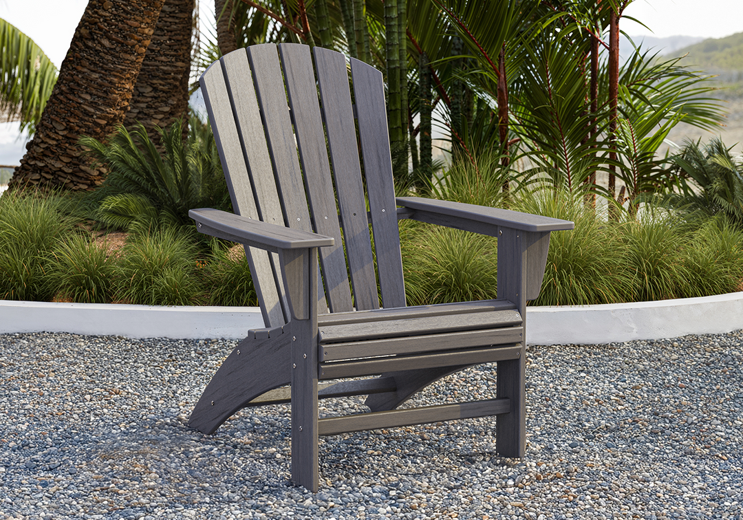
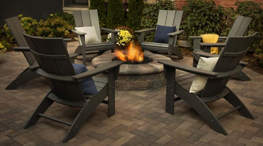
Achieve a modern aesthetic with grey hues that gracefully flow together — like the colors in a gradient. For example, these ash grey Modern Curveback Adirondack Chairs are brightened by the lighter grey and white in the striped pillows.
Pro tip:
Apply the 60-30-10 rule to create visual harmony and balance. Your furniture color should make up 60% of the visual space, with secondary colors (such as large cushions) accounting for 30%, and accent colors (like throw pillows) covering the remaining 10%.
Get inspired to redecorate your space with these outdoor patio color ideas.
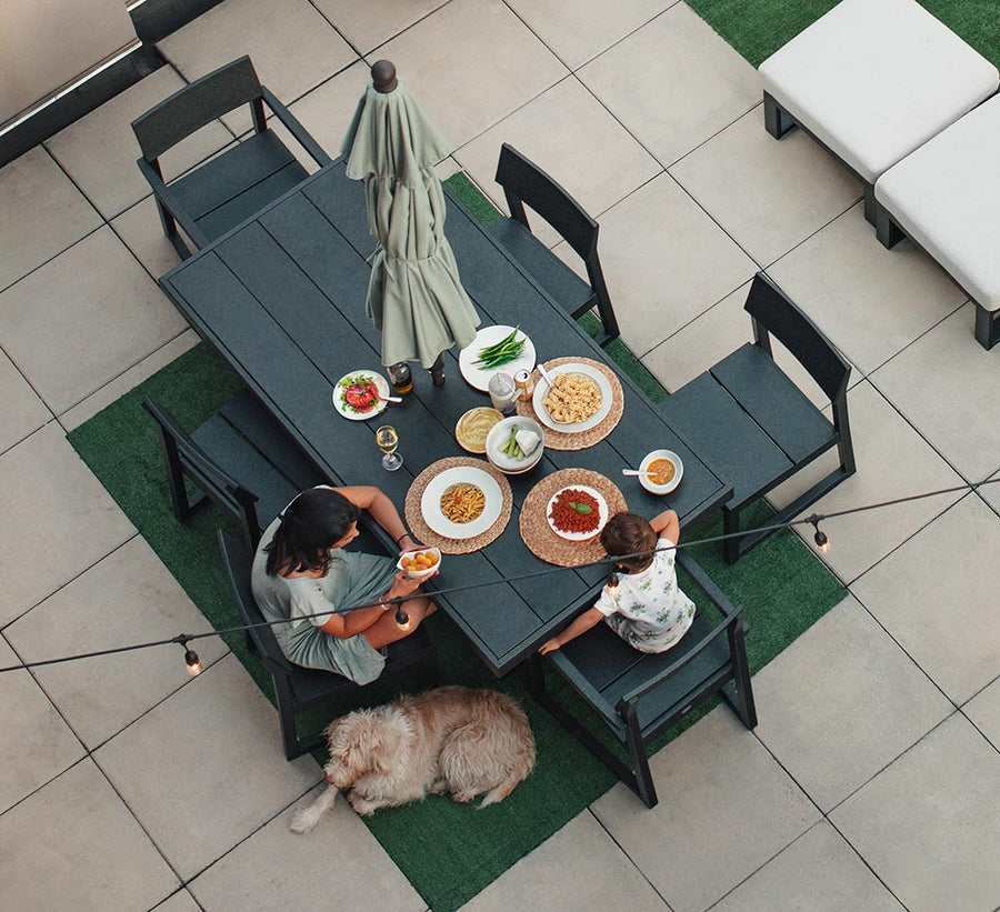
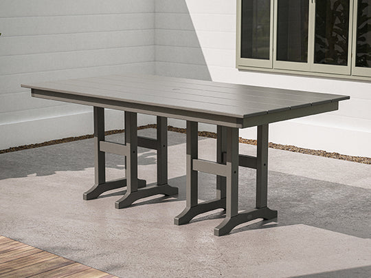
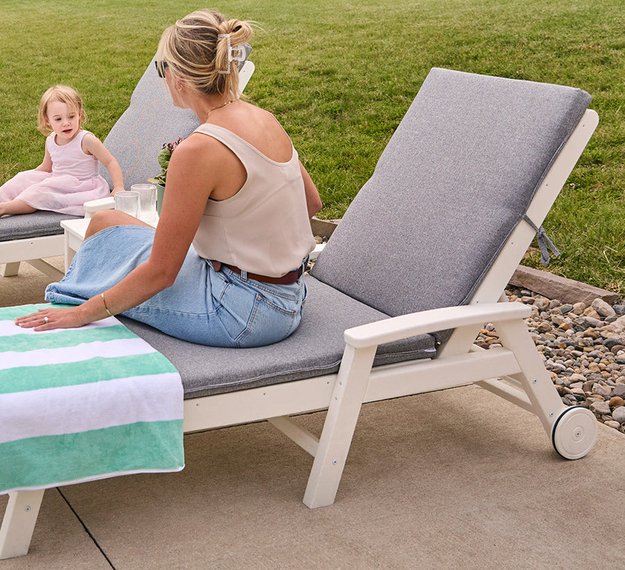
Clean, simple, and open, shades of grey and white brighten a space and make it look larger. For more contrast, use darker greys like charcoal as accent colors for outdoor furniture and trim.
Using a single hue will let you layer in drama and depth. Mix pieces in one shade with varied undertones to keep your monochromatic palette from becoming monotone. Sandy tan lounge chairs styled atop a cool greige outdoor rug is a good example.
Red, yellow, and blue naturally complement one another. To keep the look stylish, pick one bright color, use another sparingly, and add subdued versions of the third. Think blue-hued Adirondacks surrounded by red accents and hints of yellow.
If your exterior siding is white, create contrast with a warm cherry stain on the window trim and extend the look to your patio with a wooden or brown-hued lounge set. We also love the trend of building an architectural feature wall with reclaimed wood — it's a sustainable and stylish backdrop that can highlight the hues of white furniture.
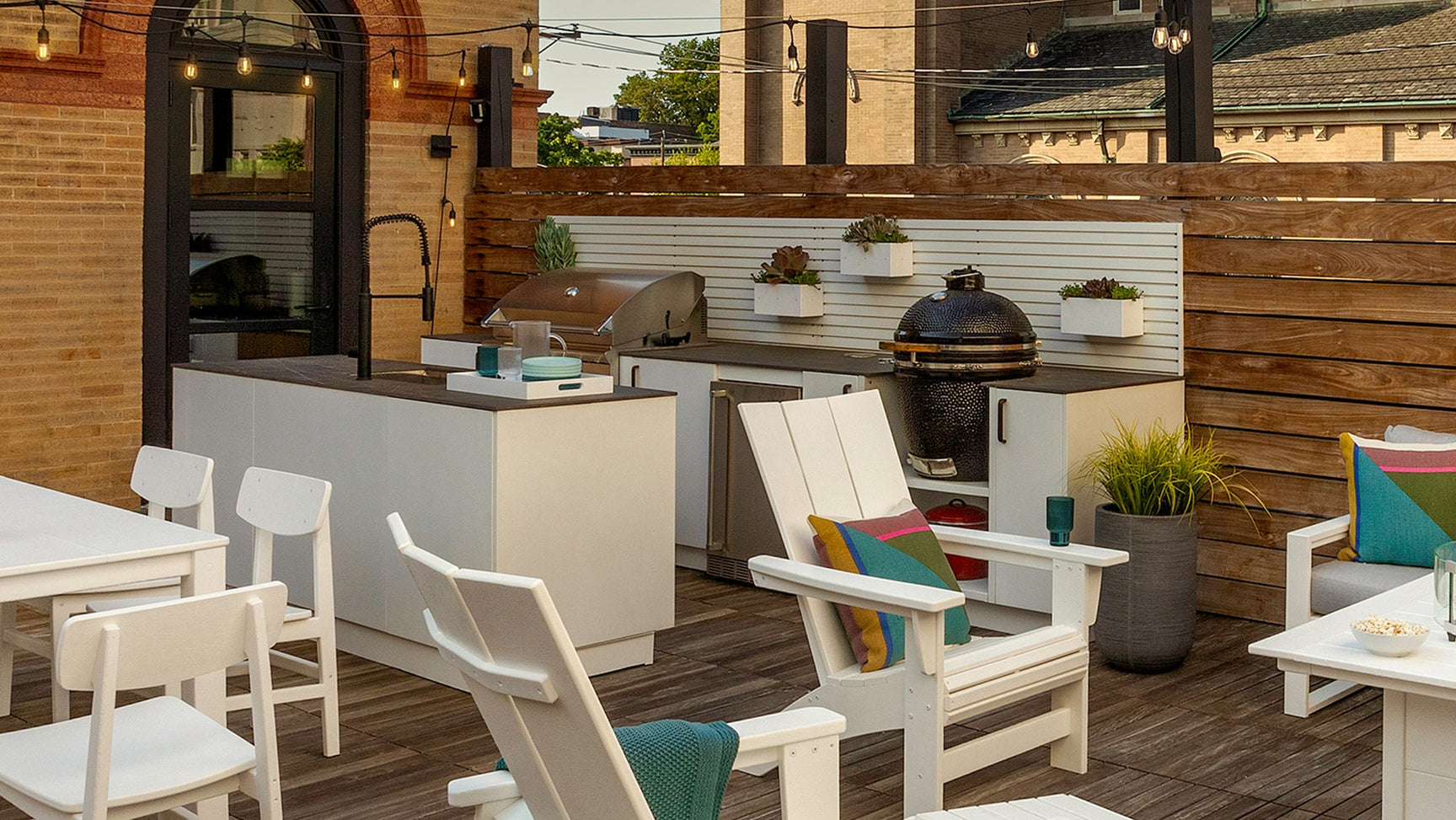
This bold trio is a popular color combination, especially in outdoor dining areas. Outfit your open-air kitchen or bar with black cabinetry and appliances, a grey marble countertop, and red stools for energetic pops of color.
Pay homage to the Southwest's sprawling desert landscapes with an earthy color scheme consisting of dusty rose, ochre, and taupe with a verdant accent shade. Textured decor like terra-cotta vases and woven jute rugs evoke tranquil vibes, and succulents, cacti, and other plants offer up hints of vibrant green.
Make your patio warm and welcoming with shades of sunny yellow and bright white. Dot the space with pots of cheerful white daisies, yellow rocking chairs, and a honey-hued rug underneath. Incorporate contrasting black accents by way of light fixtures, cushions, and door hardware to accentuate the lighter shades.
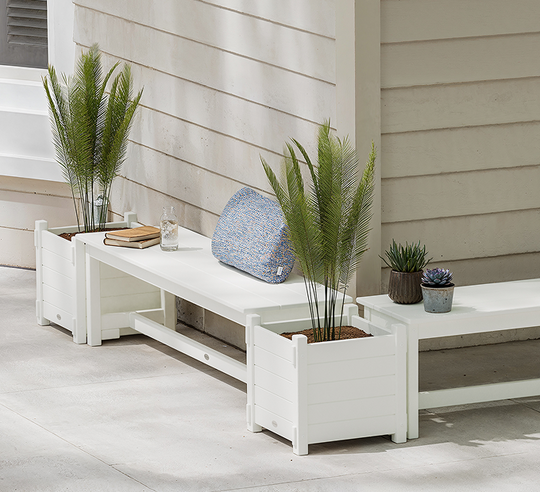
For those who love the water, try a chill color palette that emulates it. A white planter bench set with tall decorative grasses paired with oceanic fabric prints and seashell decor will bring the feeling of the shore right to your door.
If you have beige stonework and siding, complement the materials with a palette of warm browns and greens. Terra-cotta planters filled with herbs and ferns, a sage outdoor rug, and copper light fixtures are lovely accompaniments that will bring out the hues of your home.
Create a striking aesthetic with rich hues inspired by gemstones. These shades are lively and vivid, so small winks of color can have a big impact. Turquoise throw pillows, sapphire-blue planters, and metal wall art with an emerald-green finish are easy and budget-friendly ways to try out these tones.
Think beyond the paint can and introduce new hues to your exteriors in smaller or more unexpected ways.
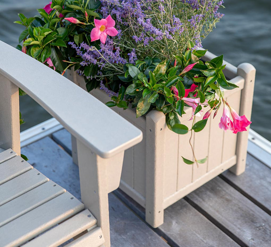
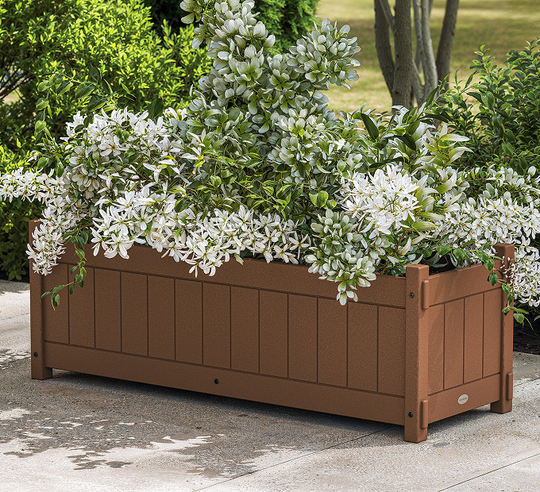
When selecting your shades, think about how you can leverage them with various materials and textiles, such as outdoor rugs and throw pillows, patio furniture frames, flower boxes and planters, and other decor.
These decorating ideas will let you display your color palette in playful ways:
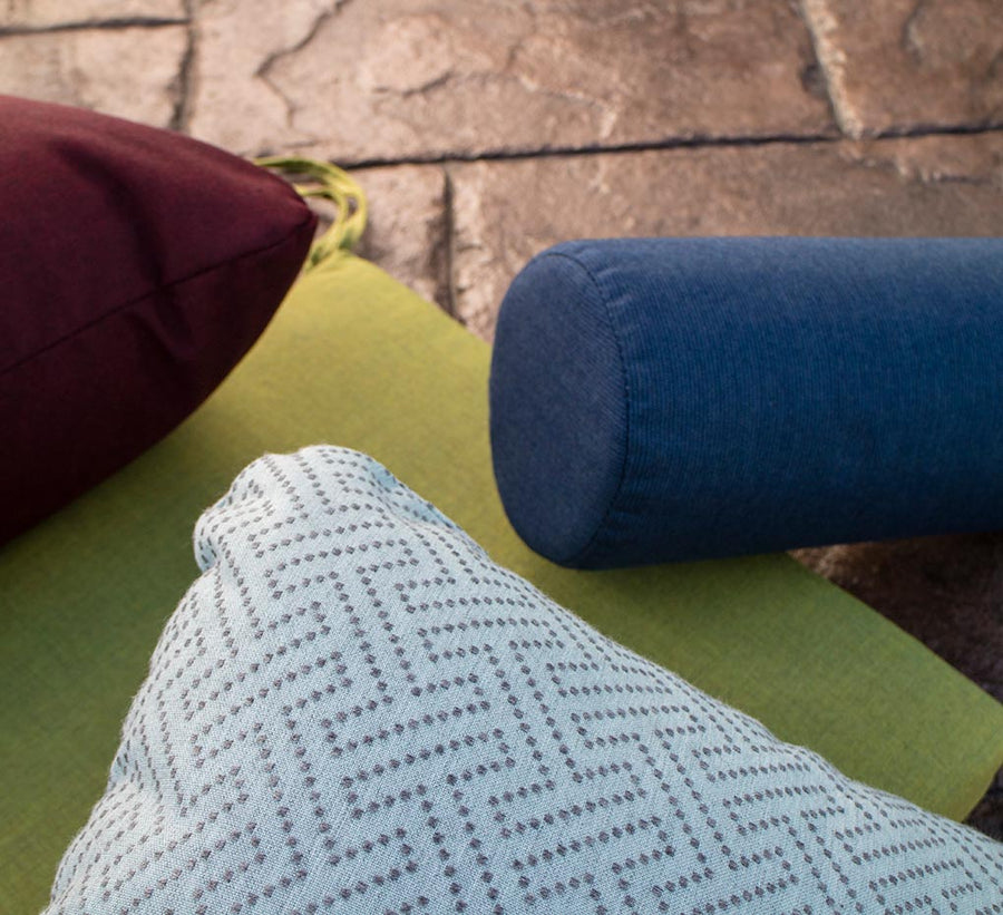
Displaying outdoor color schemes through a mix of solid shades, prints, and patterns is a clever way to add character to a patio living room.
Neutral colors like beige, grey, and white are popular for patios as they complement a variety of styles. For a vibrant atmosphere, bold hues like blue or green can add personality, while earthy tones blend well with natural surroundings.
Tan, grey, and similar neutral tones are versatile and easy to match. Bright colors can add character and energy, but fit fewer aesthetics, while darker shades are practical for hiding stains. Choose a color that reflects your style and complements your outdoor space.
Bright colors like yellow, turquoise, or coral create vibrant contrasts with grey. For a more subdued look, consider pastel shades like soft pink or lilac. If you want a sleek, modern look, the best color for outdoor cushions is varying monochrome shades of grey.
First, land your existing decor and desired theme. Neutrals like beige or grey offer versatility, while bold colors like red or black can create a focal point. Then look to the surrounding environment for inspiration. Choose colors that complement both the furniture materials and the outdoor space.
The most popular POLYWOOD color is Slate Grey, followed by Black, and then White. Our customers love the versatility of these lumber shades and style them across a range of outdoor designs.
Easily add color to your outdoor patio with plants and accessories. Style flowers in varying shades, and layer in additional colors through seat cushions, pillows, vases, and blankets. When you're ready to change the look, simply swap out the foliage and fabrics.
Color choices impact the look of patio furniture by influencing mood and space perception. Light hues can make areas feel spacious, while dark shades add elegance.
Let your home’s architectural style and existing color palette influence your furniture choices. Select pieces that fit your home’s look — sleek furnishings for modern aesthetics, colorful patio furniture for tropical or Caribbean-inspired designs, or rustic wooden pieces for cozy cabin vibes.
Caitlin Evans
Cait is an Indiana-based creative content writer who has been with POLYWOOD since 2020. She’s a Purdue alumna, a proud logophile (word nerd), and an advocate of the Oxford comma. In her free time, Cait loves gardening, cooking, running, camping, and spending time with her husband and four fur children.
Are you missing items in your cart? Sign In


